We’ve never been this close to having an official National Football League Bird Bowl, meaning a Super Bowl played between two teams named for birds. With three of the four teams battling it out in the playoffs this weekend, we’ll never have a more auspicious opportunity for the following post by Nick Lund. I’ve been a fan of Nick’s writing since the days of his first blog, birdDC and was thrilled when he resurfaced with the interview-driven Birdist. My favorite work of his was a remarkably thorough breakdown of bird-themed college teams. In that vein is this first of several incisive analyses of American professional sports bird logos by Nick:
Hello 10k Birds readers! Thanks, Mike, for the invite. This is one heck of a site you guys got yourselves.
On my own site, I sometimes like to explore the ways birds and birders are misunderstood by the media and the general public. It may be nitpicky, and the people may mean well, but I’ve spent a lot of time honing my power of bird-observation, and I’m not going to turn it off just because I’m at home on the couch. Plus, if you’re producing a big-budget American TV commercial, how hard is it really to make sure that the bird you’re using isn’t restricted to, say, the South American rainforest? Isn’t that your job? I mean, there’s a reason he’s named Smoky the Bear and not Smoky the Wallaby, right?
Regardless of whether some hotshot commercial producer cares, I care. You know what else I care about? Sports. And, as it just so happens, sports teams represent (and misrepresent) birds all the time in their team logos. So today I’m going to do a breakdown, UniWatch style, of the best and worst bird-themed sports logos in the National Football League. Grades will be given out based on ornithological accuracy and whatever other criteria I see fit. Let’s do it!
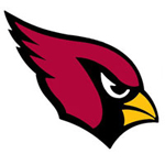
Arizona Cardinals
Unlike the baseball team, these Cardinals just went with the head. Like the baseball team, though, the Arizona Cardinals have miscolored the bird’s beak and eyes. I’m generally in favor of this logo, but it’s nothing to write home about.
Grade: B-
Atlanta Falcons
Alright, here is the time for some real tough, badass birds! None of these wimpy orioles and jays, we want some tough birds to represent some tough guys! And what could be tougher than a falcon? The fastest birds in the sky! Lightning-quick raptors that swoop from the sky! Surely the Atlanta Falcons would honor this noble family through a cool logo!
Excuse me. Excuse me. What the hell is that? Is THAT your falcons logo? That looks awful! That’s nothing like what falcons look like! OK, maybe it’s just a “hip, new” thing, and your older logo was better. Awful!
Ugh, where to begin? First, falcons have very distinct, angular wings, a feature completely botched in the logo (the logo bird’s wings look more like, what, passerines?). Second, although there is such a thing as a Black Falcon, it lives in Australia, not Atlanta. And what’s with the leg sticking out? Is he injured? Sigh. So much wasted potential.
Grade: D-
Baltimore Ravens
Look, I really want to like this logo. I think Ravens are a great mascot and an underappreciated bird. I like the Baltimore – Edgar Allen Poe’s “The Raven” connection. But… it’s purple, it’s unoriginal, and it’s ugly.
Grade: C-
Philadelphia Eagles
I mean, it’s OK. It gets points for being intense but loses a bunch more for being green and silver.
I’m not gonna hate on it, but eagles are done much better in other places.
Grade: C
Seattle Seahawks
As this website has previously established, Seahawk is another name for Osprey. Although this logo isn’t exactly realistic, it’s done in the local Native American style, so I’m not going to dock much points. Seattle sports are miserable enough right now without me piling it on.
Grade: C
So according to Nick, the Cardinals have won a rather uninspired battle of the bird logos. Let’s see if their aesthetically and ornithologically pleasing totem helps them on Sunday…







re the Falcons’ logo: which bit is the head and which bit is the leg? What I thought was a wing fold appears to have eyes?
I think it’s fine for a team to introduce its team colors into a bird logo, as long as other parts of the bird are somewhat accurate. I do wish they would color the birds’ bills properly. I also find the idea of a predatory-looking cardinal very funny.
As for the Falcons logo… ugh.
Great job Nick! Has this list been done for hockey teams yet?
Patrick, Nick has actually critiqued all the MLB, NFL, and NBA bird logos. We’ll be rolling them out as those sports seasons unfold!
Would you believe that people laughed at me when I picked all the bird teams to win last weekend? Of course, I picked the Chargers too, but that was just wishful thinking.
Ok im not a bird person but whats the big deal if the logo dosent look like the actual bird all sports logos are like that no matter if its an animal or what ever it is so calm down they just try to make them cool looking. and the falcons logo is better then the old one btw
NFL Bird logos pretty cool you have to admit
wow just because the falcons logo is a bit hard to make out doesn’t mean it sucks