
Birders have been eagerly anticipating The Sibley Guide to Birds, Second Edition, since it was announced that David Allen Sibley was working on it. The first edition, I think it is fair to say, has been pretty much become the go to field guide for North America in the years since it was first published back in 2000. We have all been wondering if the second edition would live up to the high expectations set by the first and as review copies have dribbled out over the last month some of our questions have been answered.
This is not intended to be a full review. You will have to wait until Donna Schulmann publishes her thoughts in April to get a full review of the new Sibley on 10,000 Birds. Instead, this is a collection of impressions of the new book with the hope that it will give birders considering a purchase of the second edition an idea of what they will be getting should they decide to spend the $40 that is the list price (though you can pre-order it for $24.39 on Amazon for the release date of 11 March).
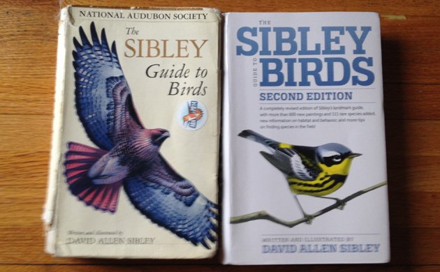
my well-worn first edition with the brand new second edition
Without further ado, let’s get into ten things about the new Sibley.
- I like the cover of the first edition more than the second edition. This is entirely subjective and rather surprised me, considering how much I like wood-warblers.
- The page on extinct species in the introduction is depressing and perfect. Every field guide should include such a page – let’s just hope that subsequent editions do not get more additions.
- The seven pages that Sibley devotes to “bird topography” and the parts of birds are, as is to be expected from Sibley, awesome. No one does these illustrations better than Sibley and they alone are worth the price of the book.
- The range maps are better because of a subtle but effective change. The maps are still shaded for regions where birds are in winter, summer, year-round, and during migration. But now, instead of green dots that pinpoint where a bird has been recorded outside of those ranges, which was an inelegant and relatively useless solution, Sibley went with a green shade to show the range where a species shows up rarely. It looks better, works better, and is a more realistic approach to vagrancy. Also, they are as up-to-date as you would expect. Especially amazing is how the Rufous Hummingbird went from having a series of green dots across the southeastern United States in the first edition, indicating a pattern of vagrancy, to having the southeastern United States shaded blue, to indicate that the species regularly winters there. Fourteen years can bring pretty big changes both to species’ ranges and to how those ranges are portrayed.
- Just like the first edition, the second edition has little surprises tucked away throughout the book. I particularly like that the owl section has a section on “Owling” in which Sibley explains both how to find owls and how to avoid disturbing them. Hopefully, those who seek owls will read Sibley’s advice and take it to heart.
- There are 111 more species included in this edition. Those who take on the thankless task of eBird reviewing should prepare themselves for having those 111 species reported more often. As many have realized, if a bird is in the field guide it is much more likely to be reported.
- As has been pointed out by others, some plates seem to be printed oddly. In particular, quite a few plates are quite dark. The red of the Scarlet Tanager seems particularly off, and many brown species seem almost black. This is definitely an issue but I don’t think it will lead to misidentification, though it might lead to more difficulty in making an identification. The plates are still amazing but I hope that later printings are not so dark.
- I find it very amusing that the Northwestern Crow isn’t even illustrated on its plate, though it does get a small image at the beginning of the Corvidae section. Instead, Sibley says that it is “essentially identical to American Crow…not distinguishable by appearance.” It is nice to see House Crow depicted, though I wonder if this might lead to mistaken identifications. That Hooded Crow is included based on the single record of uncertain origins seems like overkill, though it’s kind of cool that I saw that bird.
- The larger size of the images throughout the guide is a very good adjustment. Field guides are, after all, mostly about the depictions of birds so it only makes sense that they be as large as possible and still leave room for the text.
- In the hummingbird section the illustrations of the hummingbird flight displays have shrunk from a full page in the first edition to a half-page in the second edition. But Sibley has jammed nine different displays into the second edition versus the first edition’s five! And the other half of the page includes illustrations of wing shapes of four different genera of hummingbirds, illustrations that were scattered around the entire hummingbird section in the first edition. This is a pretty nice improvement over the previous edition.
Overall, the second edition is superior to the first edition. The layout is better, the images are bigger, more birds are included, space is used more wisely, there is lots more information, and the book is only four ounces heavier and about the same size. The only real negative is the overly dark printing, which is outweighed, in my humble opinion, by the many improvements. If the darkness of many plates can be fixed I think that The Sibley Guide to Birds, Second Edition, will take its place head-and-shoulders above the rest of the crowded North American field guide market.
…
Alfred A Knopf provided review copies of this book to 10,000 Birds.








ad 2: Remember Will Turner’s essay on extinct birds in field guides? http://aba.org/birding/v39n2p5.pdf
Looking forward to Donna’s review!
Just a nitpick of sorts. You (and others) often refer to this book as a field guide, but it’s not titled nor sized as such, In fact, Sibley HAS a field guide (2003).
I’ve always used this as an at-home (or at-car) reference for a more in-depth understanding of the birds. To call it a field guide is a stretch. I certainly wouldn’t lug it around in the field (I still carry a print guide, as I don’t have smart phone, and I think as useful as those apps are, I’m hard wired for thumbing pages to get an ID).
Thanks for providing your first impressions, of course. I’ll look for it locally to check out the issue with some of the plates and then decide if I’m going to shell out the money for it.
-CJSF
It seemed to me that a lot of the plates in the new book were dark and oversaturated at first, but as I used it more and then went back to my old Sibley, that version seemed completely washed out and inaccurate to my eyes.
I am wondering if some of the dislike of the new colors comes from being so accustomed to the colors in the old guide that we have accepted those as fact. Some of the reds still look oversaturated to my eyes, but I am not sure it is less accurate than the previous book (my Scarlet Tanager was orangey-red in the old book). I’ll be looking forward to comparing the drawings to the real thing come spring.
I’m starting to think that the original was too light and the new one too dark. The third edition will be just right!
Definitely a nitpick. 🙂
But, point taken. You would need a Sherpa if you were to use this as an actual field guide. Like you, my Sibley tends to reside on my desk or in my car.
I think this interpretation is pretty accurate. In comparing the 2nd edition to the 1st, I was shocked to see the colors that I had always thought were pretty accurate were, in fact, completely washed out.
This may be because my copy is old, though it hasn’t seen a lot of time in the direct sun.
The reds, blacks and browns are dark, that’s true, but everything else looks really nice.
The Scarlet Tanager looked a bit dark to me, but otherwise I think the colors in the new edition look pretty accurate. Even the reds in most cases look fine.
I also agree with Corey’s preference for the original edition’s cover image.