According to eBird, I have been entering checklists since December 23, 2009, and I find it an incredibly useful way to maintain my lists, plan birding travel, and keep up on my favorite hotspots. eBird automatically organizes my observations by country, state, and county, and keeps running totals for my life and year lists. Indeed, without eBird, I would not have any lists at all.
In April 2016, eBird added “Profile Pages” and the announcement stated (lightly edited):
This first version of your public eBird dashboard focuses on showcasing your eBird activity with tools that visualize all your sightings and highlight your recent media contributions—all updated with each new eBird contribution. We hope these Profile Pages provide a fun new way to visualize the contributions you’ve made to eBird, inspire you to ‘fill in the gaps’ in your profile maps, and allow you to get to know other eBirders by exploring their Profile Pages.
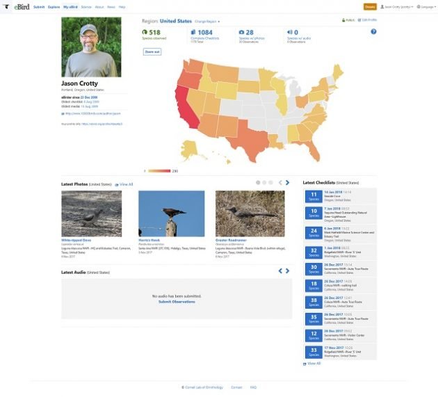
You must opt-in before you get a Profile Page, so I dutifully set one up and it contained much of the same information, but organized and displayed in different ways. Those differences matter.
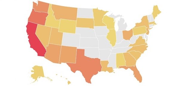
For example, the Profile Page (mine is below) displayed state-level checklist information as a map with darker shades indicating more species observed and lighter shades indicating fewer. The states that had no checklists at all were shaded an empty gray. This information had been available before on the “My eBird” page, where state-level information could be viewed via the “State/Province” tab. But the information was simply listed and unless you manually created a checklist, it was impossible to determine which states were “missing.” (The same is true for county-level information.)
But the map on the “Profile Page” changed that completely. Although California and Oregon (my two home states since I started eBirding) were heavily shaded and the map reflected checklists submitted during a long cross-country road trip, there were entire regions that were gray, particularly in the middle of the country.
The cartographic presentation suggested, of course, that one should aspire to a map without “gaps.” If you are tracking your life list, that’s not a difficult sell for the folks running eBird from Ithaca, New York.
Some states just seemed to taunt. In particular, Michigan was gray, indicating complete failure to submit even a single checklist. But I had spent years in Ann Arbor attending law school at the University of Michigan, albeit before I started birding. And Colorado showed a similar shortcoming, despite the fact that I have made countless business trips to Denver. Other states, such as North Dakota and Arkansas, were also gray, but those seemed less troublesome, since I have never visited either state.
But displaying information with a map does not treat all states the same. On eBird profile pages, size matters: tiny Delaware is barely noticeable whereas Nebraska, Kansas, and Missouri are conspicuous. Alaska, however, is a tiny fraction of its relative size and is relegated to tiny space beneath California, next to Hawaii. But that’s better than other parts of the country, such as the U.S. territories, some of which are missing entirely. eBird inexplicably treats some (but not all) U.S. territories as separate countries. On eBird, the District of Columbia is part of the United States but Puerto Rico is not.
Naturally, this has “inspired” me to “fill in the gaps” in my profile maps. At some point, I will certainly get to Michigan, Colorado, and the other states that are “missing.” In other words, I will do just what eBird intended when it introduced Profile Pages.
# # #







Not only that but they give you your checklist streak when you log in which makes you not want to miss a day!
Those eBird folks are diabolical…