10,000 Birds has flaunted the same style for far too many years. The time has come to upgrade the look and functionality of the site. We’ll be working on this change over the next few days. Please forgive us if you find your favorite features in unfamiliar places and let us know how you like our new look!
Recent Posts
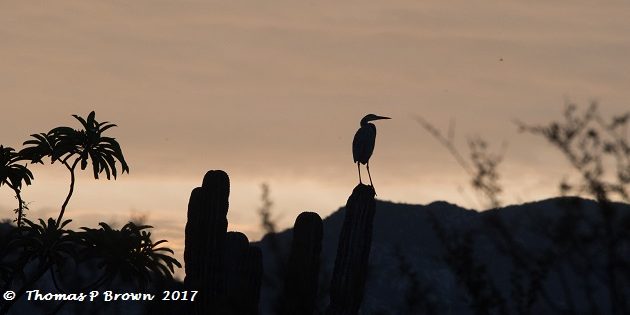
 Daybreak at the OasisBy Tom Brown
 In search of the Citril FinchBy David T
 Podcast: Hannah and Erik Go Birding; Tala Game Reserve & WakkerstroomBy Hannah
 Species Spotlight: Great Grey OwlBy Kai Pflug
 Bird Guides of the World: Daniel Edelstein, California, USABy Editor
 Top 10 OnomatopoeiaBy Peter
 Ask a Birder: What to do when encountering a baby songbird outside of a nest?By a Guest
Welcome to 10,000 Birds!
Learn about our site and writers, advertise, subscribe, or contact us. New writers welcome – details here!
Posting Calendar
| DAY | WRITER(S) | SERIES |
|---|---|---|
| MON | Kai (w) | Birding Lodges (w) |
| TUE | Donna (m) Susan (m) Hannah (m) Fitzroy (m) | Bird Guides (w) |
| WED | Leslie (bw) Faraaz (bw) | Ask a Birder (w) |
| THU | Paul (w) | Birder’s Lists (w) |
| FRI | David (w) | Species Spotlight (w) |
| SAT | Peter (bw) Luca (bw) | From the Archives (w) |
| SUN | Clive (w) Valters (bw) | Three Photos (w) |
| w weekly, bw biweekly, m monthly | ||
| Any time: Jason, Mark, John, Sara, Rolf, Dragan | ||
See here for info on the writers.
Newsletter
Signup and receive notice of new posts!
Thank you!
You have successfully joined our subscriber list.







I like the new look, however, it would be nice if each author’s name was listed with the post title. Thanks.
I fervently hope that means you are moving away from white text on black! Now I read your posts in Google Reader where I get the vanilla version.
I absolutely agree with the above poster–white on black or white on green is very hard to read. You’d be better served with an emphasis on readability rather than coolness. In the same vein, did the type size get smaller? I have a large monitor but everything looks smaller which also exacerbates the white on black problem.
Great comments, which we will take into account as we proceed. Of course the coolness factor is important to us, but we also like a dark background because of the way photos look against it.
White on fluorescent green. Cool? Maybe. Completely unreadable? You bet.
(I think it WAS once cool … now clean, minimal, classic readable white on black is what I see)
http://blog.tatham.oddie.com.au/2008/10/13/why-light-text-on-dark-background-is-a-bad-idea/
‘It might feel strange pushing your primary design goals based on the vision impaired, but when 50% of the population of have this “impairment” it’s actually closer to being the norm than an impairment’
sorry, I’ll write that again. The pro/techie bloggers are going with classic black text on white