The intersection of avians and professional athletics in America can be fascinating, especially when looked at through the right lens. Nick Lund, who blogged first at birdDC and then the interview-driven Birdist, has always offered an engaging, if not slightly askew view of teams and their bird logos. This is Nick’s second 10,000 Birds guest post on this topic…
Hello 10k Birds readers! Have you ever noticed how many ways birds and birders are misunderstood by the mediaand the general public? This may seem nitpicky and the people involved may mean well, but I’ve spent a lot of time honing my power of bird-observation, and I’m not going to turn it off just because I’m at home on the couch. Plus, if you’re producing a big-budget American TV commercial, how hard is it really to make sure that the bird you’re using isn’t restricted to, say, the South American rainforest? Isn’t that your job?
Regardless of whether some hotshot commercial producer cares, I care. You know what else I care about? Sports. And, as it just so happens, sports teams represent (and misrepresent) birds all the time in their team logos. I’ve already looked at the bird logos of teams in the National Football League. Now I’m going to do a breakdown of the best and worst bird-themed sports logos in Major League Baseball. Grades will be given out based on ornithological accuracy and whatever other criteria I see fit. Let’s do it!
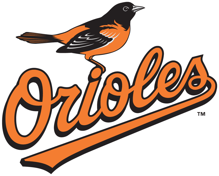
Baltimore Orioles
Although they are a perennially crummy baseball team, the Baltimore Orioles represent the pinnacle of bird-sports achievement. First, they are the only team that I know of which includes the team’s geographic location as part of a species name: the bird is named the Baltimore Oriole, and the team is the Baltimore Orioles. Genius. I really wish more teams would do this, and someday birders around the country could celebrate when the California Condors play the Nashville Warblers in the World Series.
Second, the Orioles logo is, ornithologically speaking, far better than the vast majority of other cartooned, wacky logos. Although the Orioles logo hasn’t always been so accurate, the current version looks to be right out of a field guide. Closer inspection reveals some inaccuracies, however. Unlike the bird in the logo, actual male Baltimore Orioles have gray/blue bills and no cream eye-ring. I could quibble about the amount of white in the wings or the orange legs, but I’ll let those details slide as artistic license. I mean, at least the team isn’t making a mockery of the bird. Oh, wait… let’s move on.
Grade: A
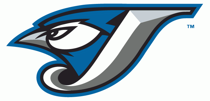
Toronto Blue Jays
Another mediocre American League East team that has chosen a small, not-particularly-intimidating bird as its mascot. I love the logo, though. At least, I love the one the one they used to wear, before they started to make a mess of things.
Like the Orioles, the Blue Jays logo isn’t ornithologically perfect. The biggest difference is, of course, that real blue jays have black bills, not dark blue or silver, and black on the face. I’m a bit surprised that the pattern hasn’t been fixed, actually, because it would fit with the team’s adoption of black as a third color (with the resultant tragedy of these ugly jerseys being forced on us every year). It’s a pretty logo, though, and Blue Jays not a bird that traditionally gets the sports-team treatment, so they’re OK in my book.
Grade: A-
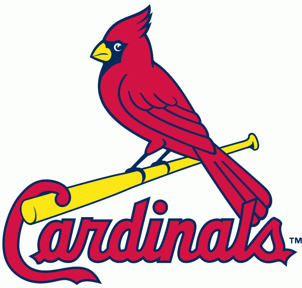
St. Louis Cardinals (Corey’s favorite team!)
As far as I can tell, the Cardinals are the oldest bird-named team in the country since changing over from the weirdly-named Brown Stockings in 1900 (and that would be this kind, not this kind). And it’s a good thing, too, because their logo is classic. It’s not perfect, though. The beak and legs are bright yellow, while on a real male Northern Cardinal they are red/orange and dark pink, respectively. The eye of the logo is also not the black it would be in real life, but, as with the Orioles, I’ll let that slide as artistic license. Note that the logo used by the Cardinals from 1967-1997 get the beak and legs colors a bit more realistic, and adds a funky little hat. Good work, St. Louis.
Grade: A
Boston Red Sox
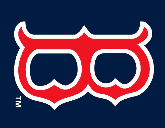
What do the Red Sox have to do with birds? Am I just putting them on this list because they are my favorite sports team? Well, yes and no. Check out the Red Sox “B” emblem. Got it? Okay, now turn the B ninety degrees clockwise. What do you see? Yes, it’s an owl. See it now? Isn’t that cool? Somewhere along the line I thought that it was used as a logo for some college (Rice Owls? Temple Owls?) but I haven’t been able to confirm that.
Grade: A for coolness












Another tidbit: the Cardinal’s logo, elaborately stitched on the player’s jerseys, makes for the most expensive uniform in the sport.
Nice work, Nick! I’d never thought about that before. You should take a crack at some of the minor league teams!
I’m glad to see the return of avian uniform blogging in a more prominent location.
I approve of all Red Sox related propoganda.