
Sometimes it takes an unexpected question. When my friend Victoria, who lives in Georgia and who is an avid birder but who is not an avid reader of blogs and social media, asked me “Should I buy the new Sibley? Is it different from the old Sibley?” I realized that I was writing this review all wrong. Victoria is a down-to-earth person, and she wouldn’t want to read the many paragraphs I’d already written full of detailed observations and statistics, some even written down on the computer and not in my head . She would want to see the difference between the two editions. So, I am writing this review for Victoria. I am also writing it on the tails of an excellent review by Corey who, although he termed his post a collection of “impressions,” really did nail down the great content of The Sibley Guide to Birds, Second Edition, by David Allen Sibley, as well as the minor items that need to be improved.
I’m going to start with a specific example: species accounts for Common Tern and Arctic Tern. How have these species accounts changed from The Sibley Guide to Birds, published in 2000 (heretofore called Sibley One) to The Sibley Guide to Birds, Second Edition, published in March 2014 (and heretofore called Sibley Two). I decided to start with these terns because they are not easy identifications, and are likely to be consulted by birders at all skills levels. I also selected them because I like terns. If you don’t like terns, don’t fret; other species will be brought into the discussion very soon. (And, please note that any inconsistencies or tilting of margins in these scanned images are from my faulty scanning, not from the books themselves.)
Sibley Guide to Birds, 1st Edition:
Sibley Guide to Birds, 2nd Edition:
There are some obvious differences here:
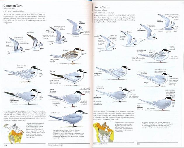
– The images of the birds are larger. I like this. It’s a lot easier to see details like the dark outer webs on the flying Common Tern’s tail (an important detail that helps differentiate it from Forster’s Tern) and the proportions of legs to body that differentiates Arctic Tern from Common Tern.
– The images are arranged differently. In Sibley One, the images of the terns flying are shown in a columnar format, on the left side of the page. In Sibley Two, the in-flight images literally fly across the page in slight diagonals, with the full-bodied images are presented below in a parallel order (meaning we see the same bird–fresh juvenile, worn juvenile, 1st year, Adult breeding, Adult nonbreeding–in the same part of the page for each species). Sibley One presents the images in a parallel order as well, but the in-flight images at the top give the pages a fluency and attractiveness you don’t see in the older edition. This is not true of every species account, but the fact that it was done here tells me that Sibley looked at every single page of Sibley One with an eye as to ‘how can this be done better?’
As in the first edition, all bird images for all species are drawn facing or flying right. In the case of hawks, this often means flying up and to the right, and in the case of White-breasted Nuthatch, this means facing down and to the right. But, always to the right. (There are exceptions: some full-frontal views, owl back views, and, strangely, a section on Kingfisher Behavior in which the kingfishers are facing left). The uniformity of view helps us see differences amongst similar species and plumage differences amongst different stages and genders of the same species. It’s also just a lot easier on the eyes as you browse through the book.
– Text: Both editions start off with the basics—Common name, scientific name, dimensions in inches, weight in ounces and grams. Not a part of tern descriptions, but useful elsewhere, are the symbols indicating if the female is larger than the male. Or vice versa. This is followed by a brief paragraph summarizing the species’ appearance and how it is similar and different from species with which it could be confused. Distinguishing field marks are expanded on in the text accompanying the images.
Birders tend to focus on images, but text was and is one of the strong points of The Sibley Guide to Birds. Descriptions are pared down to the most important points, and while they are not technically intimidating, they also don’t shy away from using terms like “coverts” and “primaries” when necessary. So, how much has the text changed in the new edition? In the case of Common and Arctic Terns, these descriptions have been totally rewritten, with more emphasis on solid physical details, less emphasis on giss. (note: italics used here are mine, intended to set off the quotations.)
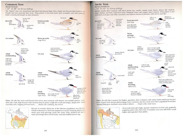
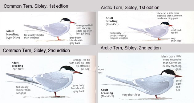
Sibley One on Common Tern:
The “typical tern; very streamlined with direct but buoyant flight. More slender and buoyant than Forster’s, but broader and more powerful than Arctic. Wing pattern is best field mark: dark secondaries and outer primaries frame a translucent triangle on inner primaries.
Sibley Two on Common Tern:
Very similar to Forster’s and Arctic Terns. Told from Forster’s by slightly slimmer proportions, darker gray upperwing; in breeding plumage gray belly; in nonbreeding plumages dark hindcrown, dark carpal-bar. Told from Arctic by details of proportions and wing pattern.
Sibley One on Arctic Tern:
Slightly smaller than Common with much shorter legs; smaller, rounder head; shorter, thinner bill; relatively longer, thinner, and more swept-back wings. Wingbeats deeper and snappier than Common. Wing pattern is best field mark at all ages; note white secondaries and uniform translucent primaries with narrow, dark tips.
Sibley Two on Arctic Tern:
Slightly smaller than Common Tern, with shorter bill, rounder head, much shorter legs and narrower wings. All plumages show pale gray and white primaries with small dark tips. In breeding plumage note long tail, all-red bill.
All species descriptions in Sibley Two appear to have been rewritten with less reliance on overall impression and more detail on diagnostic field marks. We see this in the descriptions of Western Sandpiper. In Sibley One, Western Sandpiper is “Usually longer-billed than Semipalmated; averages heavier with relatively, shorter wings and longer legs, lending a subtly front-heavy appearance”; in Sibley Two (below), Western Sandpiper is “Slightly larger than Least and Semipalmated Sandpipers, with slightly longer and more dropping bill. Breeding and juvenile plumages show rufous highlights on scapulars and head. Smaller than Dunlin, in nonbreeding plumage paler above with whitish breast.”
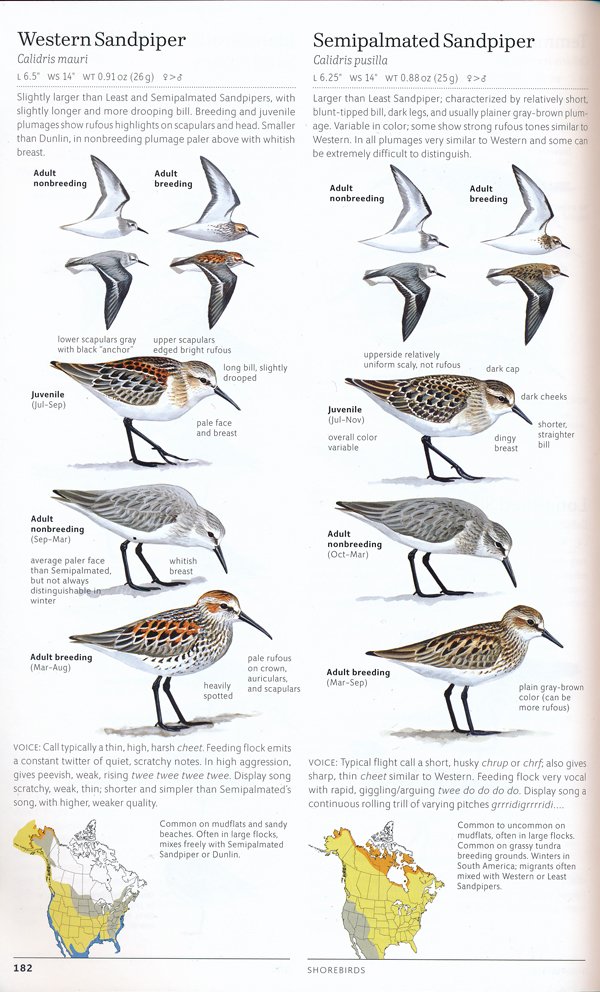
Goodbye “front-heavy appearance.” This is a phrase I’ve heard from more experienced birders over the years. I don’t know if it originated with Sibley or if Sibley was passing on shorebird wisdom in the common domain. It will be interesting to see how well it survives now that it has been dropped from the Sibley Guide. (The phrase is also used in the Stokes Field Guide to the Birds of North America and The Shorebird Guide by O’Brien, Crossley, and Karlson, so it hasn’t been totally abandoned.)
On the other hand, the identification points accompanying the images appear to be exactly the same in both editions. (As always, there are exceptions: For Arctic Tern, the adult breeding image no longer has the annotation “tail usually projects slightly beyond wingtips”; I suppose a response could be that the general text now includes the line “in breeding plumage note long tail”, but I think the original note is more specific and preferable.)
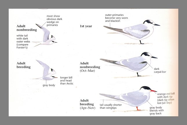
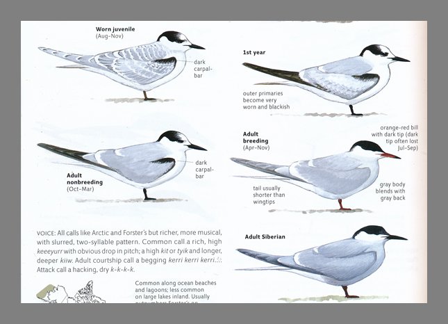
More importantly, the arrows are gone! Well, they weren’t really arrows per se; they were lines linking text to the part of the bird being described (see close-up above). A line linking “gray body” to the bird’s body. A line linking “outer primaries” to the primaries. Gone gone gone. There are some remnants of this essential part of the original Sibley design; dotted lines connecting “dark carpal-bar” to the dark carpal bars of the worn juvenile and Adult nonbreeding Common Terns (see below) and to the bars of the Adult nonbreeding Arctic Tern. But, no dotted lines for the dark carpal-bars of the Fresh juvenile and 1st year Arctic Terns. Dotted lines linking the text describing primaries and secondaries of the flying Arctic Tern images, but no dotted lines for the dark secondaries and translucent inner primaries of the flying Common Terns. It’s confusing.
The elimination of the linking lines is a break with the heritage of Roger Tory Peterson. The arrow system is a defining feature of the field guide system created by Peterson, and they live on in the series based on his books. The first Sibley’s was hailed as the modern day successor to the Peterson guides, and his linking lines, refined with actual text at the other end of the image (the Peterson arrows are just there, you need to read the text on the next page to see what they’re referring to), were a part of that heritage. Peterson used arrows, Sibley used lines. (National Geographic, the third prominent bird identification guide utilizing drawings uses lines occasionally, but not to the extent of Sibley One.) You can interpret this major change as Sibley creating his own design template, utilizing placement to create connections and putting more trust in users’ basic knowledge. I just wish there was a little more uniformity in how the design was implemented.
More on the differences between these tern pages:
– The headings of Sibley One are missing in Sibley Two. In this case, the heading is “Medium-size Terns” with a sentence on each page describing where the tern is likely to be found and a few behavior tidbits. This information is now included in the new text accompanying the range maps. We learn that Common Terns nest “in large colonies on sandy or rocky islands” and feed “on small fish captured in plunge-dive”; Arctic Terns nest “in colonies on small islands, often mixed with Common Tern and that their habits are “similar to Common Tern.” Not a comprehensive description of behavior, but more information than offered in Sibley One and very helpful for identification and appreciation of these birds.
– Speaking of range maps, the Sibley Two maps are no longer set off in 1 ¼ – inch squares and they are slightly, very slightly, longer—about 1 3/8 – inch square, which gives North America a more elongated shape. The maps terminate along the broken line that now runs along the bottom margin of the page, separating the species account from the page number.
– The range maps have been updated in deeper colors that more clearly depict summer/breeding range, migration area, and areas of rare occurrence. The latter is indicated by expanses of green-gray rather than green-gray dots. The huge improvement here is the text next to the maps, which states if a bird is “common along ocean beaches and lagoons; less common on large lakes inland” (Common Tern) or if the bird is “common within breeding range; uncommon migrant in small, numbers over open ocean far offshore” (Arctic Tern). Whereas Sibley One offered uniform range maps, all of North America in its entirety, there are some maps here that zoom into a species’ very specific range. Aleutian Tern shows Alaska, Bridled Tern zooms into the Atlantic and Gulf of Mexico coasts, with the added bonus of showing the year-round area off of Florida, on the eastern and southeastern coasts.
– Color: It is hard to talk about color when you are dealing with terns, which are mostly black and white and gray. But, terns do have bills and legs, and at certain ages, these bills and legs are “orange-red” or “red”. And, there are significant differences in the colors of these features in Sibley One and Sibley Two. The Sibley One Common Tern’s “orange-red bill” and legs (not described in the text) look orange-red to my eyes. The Sibley Two counterparts look deep red. The Sibley one Arctic Tern’s “small dark red bill” and red legs (again, not described in the text) look bright red. The Sibley Two counterparts are a very dark red.
I am not a color expert (I needed a color expert to pick out the colors of my apartment walls because I can’t even tell the difference between white and linen white). But, I do know that color is complicated, a function of light, whether the light is absorbed or reflected, and how the rods and cones in our brains perceive that light. So, how do we evaluate the portrayal of color in a field guide? In The Warbler Guide, Tom Stephenson and Scott Whittle drew on science to create sonograms, visual depictions of bird song that showed just how a Pine Warbler trill really was different from a Chipping Sparrow trill. I wish we had the equivalent for color.
In the absence of a scientific baseline, these questions must be answered subjectively: (a) “How well does Sibley portray color in this second edition?” and (b) “Does Sibley’s portrayal of color help or hinder my efforts at bird identification?” I hope those of you who disagree with my answers will talk about your views in the Comments section.
(a) The colors are more intense. The blacks are blacker, the grays are deeper, the yellows are richer, and the reds are darker. As we see with our Common Tern image, a bill that should be orange-red looks dark red. On the other hand, the Arctic Tern’s bill was too cherry bright in the first edition, and looks more appropriately dark red in Sibley Two. So, the color intensification works both ways.
It is not clear how much the intense colors are due to inking and how much to the color of the pages themselves. The pages of Sibley One are a comforting off-white (probably similar to the linen white of my ceilings). The pages of Sibley Two are a very bright slightly shiny white, against which the yellows of the Grasshopper Sparrow’s breast and the red of the Summer Tanager just leap out and hit you in the face. And, while my initial reaction to that buffy-yellow Grasshopper Sparrow’s breast was “too yellow!”, a check of my own photographs and notes from the field indicate that no, it’s not. Memory can be a tricky thing, assisted by assumptions and tradition (sparrows are not always ‘little brown jobs’).

(b) Yes. The images’ colors are helpful for the most part, but there are a couple of drawings in which the intense color may cause confusion. In most cases, color is a relatively small element of bird identification. We look at size, structure, proportion. (My first birding instructor, Starr Saphir, started off the Introduction to Birding workshop by having us describe a bird without using color.) We use color to help determine age and gender, and to enhance our enjoyment of the bird. (Really, how can you not look at the blue of a Blue Grosbeak or the shining yellow of a Prothonotary Warbler and not pause in wonder?) But, there are times when you need to evaluate the color of a bill (Royal Tern or Caspian Tern?) or the color of legs (yellow or greenish?) to narrow down an id. And, while the yellows and blues look good to me, I would prefer to have my reds and orange-reds more true to the colors described in the text next to them.
– Font. Sibley One was composed with a Times Roman style font with image notations in a smaller sans serif font. It worked. The two styles complemented each other and helped set off the image notes from the general text. And, the fonts were black, which meant they could be read from across the table or over the shoulder of your birding friend in the front seat of the car. Sibley Two is composed of a thin sans serif font with headings in a complementary serif font. The headings are black; the text is gray. And, unless I am reading the book in direct sunlight or under a 75 watt bulb, with my glasses off, I have a hard time. This is a real problem and a disservice to the wonderful content of the book. Please, Knopf, fix this.
– Voice. Descriptions of calls are exactly the same here for both editions and appear to be little changed for other species accounts. Sibley both describes the sound of the call or song and transliterates it. The voice sections for each species are longer and more comprehensive than those of other guides; the Blackburnian Warbler account, for example, includes its song, alternate song, call, and flight call.
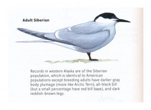
– Anything else? Yes, we are still looking at the Sibley species accounts for Common Tern and Arctic Tern. And there is still more to say. Because, we get a bonus bird in the second edition, the image of the Adult Siberian population of the Common Tern, mentioned but not shown in Sibley One. I find this very exciting. Not because I’m going to western Alaska any time soon, but because it symbolizes for me what is so great about the new Sibley’s—the fact that David Sibley has gone through his iconic original edition page by page, line by line, and made every attempt to give us more.
Which is my cue to go from the specific to the general and talk a bit about the book as a whole. The Sibley Guide to Birds, Second Edition covers 923 species, an increase of 114 from the 810 covered in the first edition. (Out of curiosity, and because I can be obsessive, I sat down and counted the number of birds in Sibley 2 and came up with the number 924. I am not sure if this is because Sibley did not count the Scarlet Ibis entry or because I miscounted, but I am not going to do a recount.) Some of the 114 additions are new species resulting from taxonomic splits (Pacific Wren, for example), but most are birds that were considered rare, accidental, exotic, or just unlikely to be seen by birders 14 years ago. The Albatrosses, Petrels and Shearwaters chapter has increased from 20 to 31 species and Storm-Petrels from 8 to 12 species, Shorebirds from 62 to 76 species.
This makes Sibley Two one of the most comprehensive identification guides out there, with the National Geographic Field Guide to the Birds of North America, 6th edition at the top with 985 species. (Species covered in National Geographic not covered in Sibley include vagrants for which there are only one or two records, in some cases dating back to the 19th century or of uncertain origin.) Sibley explains his criteria for birds included and not included in the Introduction, and it seems clear that his focus was on coverage of the most birds that the most people are most likely to see or that will be seen in the near future. So, that Spotted Flycatcher, seen in Gambell, Alaska in 2002? Not included. (Neither is Amazon Kingfisher, which at the time of writing had only been seen on the U.S. side of the border one time in 2010. I was fortunate to see the kingfisher when it showed up again in the lower Rio Grande last November, and I even got to witness David Sibley scoping the bird out. He did not seem bothered in the least that it wasn’t in this volume; I am sure he is already planning for its inclusion in edition 3.
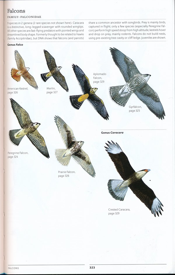
Birds are arranged in taxonomic order, organized into sections based on families. In some cases, families that were separate in Sibley One are grouped together in Sibley Two (Mockingbirds, Thrashers, Starlings, Accentors, Wagtails, and Pipits–yes, that is one section). The family Laridae, on the other hand, is split into two sections, Gulls and ‘Terns and Skimmer’. These re-arrangements appear to be partly to make the organization more accessible to the user and partly as a way to puzzle in more birds. Each section begins with an introduction to the family (or families), noting number of species, shared characteristics, and small, proportionately-sized images of each species. In a huge improvement, Sibley Two includes page references for each species (see Falcons introductory page above). Rare species are still not always depicted in the introductory pages. I’m not sure if this is a way to save space or if Sibley doesn’t want to create a false impression or expectations. (I did find an error in the introductory page for Orioles and Blackbirds. The family is said to include “26 species in 8 genera (3 rare species not shown here)”. I could only find 24 species in the chapter, the 23 depicted on the introductory page and 1 rare species, Black-vented Oriole. Since National Geographic also only covers 24 species, I’m thinking this must be some kind of typo or oversight.)
Subspecies are a concern of advanced birders. Sibley continues the treatment of subspecies conceptualized in the first edition and explained in his Introduction: “I have tried to illustrate all distinctive regional populations, emphasizing variation rather than the species unit, on the premise that any distinguishable population is noteworthy, whether it is classified as a species or not.” Instead of scientific names, he uses the geographic region where the subspecies breeds (often utilized in the scientific name) or established popular names. The Savannah Sparrow species account, for example, includes Ipswich, Belding’s, and Large-billed subspecies, the most well-known of the many Savannah Sparrow populations. I understand Sibley’s reasoning here. But, as a birder who is starting to become interested in regional variation and the idea of subspecies, I would really like to see the scientific names included. I don’t think it distracts from the presentation of the birds’ differences and I think it helps the brain keep the varying populations organized for future reference. There is a reason we give the same name to things that look and act the same and different names to things that look apart, different. Language helps our brain keep the minutiae of the world organized. Meanwhile, National Geographic and Stokes can be consulted for scientific names of subspecies, with Stokes listing many more than presented in Sibley Two or National Geographic. (I am indebted to a brief but challenging Facebook conversation on this subject for these thoughts; thank you Facebook friends and subspecies lovers.)
I do need to talk about access. Content is what we tend to think about when we look at identification guides, but getting to that content is just as important. Can we find the bird we want and can we find it quickly? Like the first edition, Sibley Two offers a Quick Index, a 1-page listing of species and page numbers, at the end of the volume. This is preceded by a traditional Index, listing birds by common name and scientific name. As has become the custom, the index is only helpful if you have some basic knowledge of the bird you are searching for. If you are looking for the name of that duck with the red head, you won’t find it under “Duck”, you will have to look under C for Canvasback or under R for Redhead. The general location of the section on Ducks, Geese, and Swans can be found in the front, in the Contents listing.
Sibley One employed colored tabs at the top of the page to denote section Introductions. These have been dropped in Sibley Two. This makes The Sibley Guide to Birds, Second Edition the only major North American bird identification guide that does not employ tabs (National Geographic) or colored indexing along the page edge (Stokes, Smithsonian Field Guide to the Birds of North America, Peterson Field Guide to Birds of North America, Kaufman’s Field Guide to Birds of North America), or a Visual Index (National Geographic) to help users locate bird families and species. I think this is an area where Sibley and his design partners can do better.
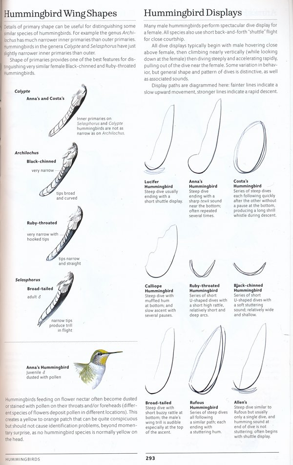
There are many notable things about The Sibley Guide to Birds that I still have not raved about. I intend to read and then read again the many little tutorials on bird identification scattered throughout the book (I counted 61). These range from a couple of sentences to half a page and discuss items such as Hummingbird Wing Shapes, Hummingbird Displays, Eyeshine (in Nighthawks), Woodpecker Drumming, Diving Motions of Ducks, and Warbler Hybrids. They are a wonderful way of expanding (or reinforcing) birders’ identification knowledge base. I only wish there was a way of accessing these nuggets of info without browsing through the book. Again, access is important.
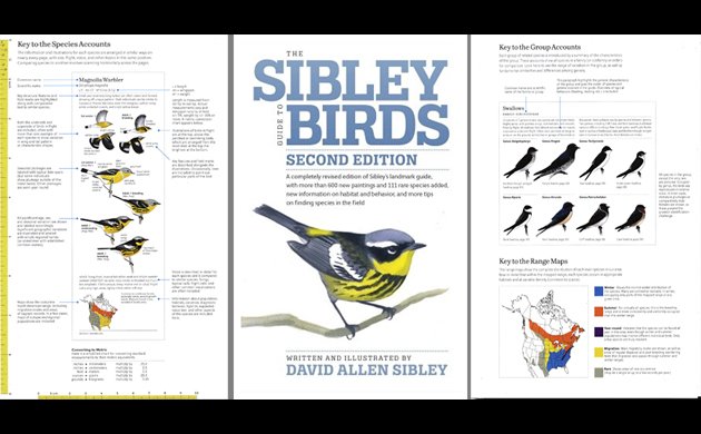
Also notable, as Corey points out, is the 7-page section of the Introduction on Bird Topography, a collection of diagrams of bird anatomy. Sibley not only delineates the parts of passerines, shorebirds, ducks, and gulls, he offers close-ups of wing feathers, tails, and head feather patterns, illustrating how posture or the opening and closing of a tail can effect the patterns that we see. The diagrams are large and the anatomical names are in bold print, making them easier to read than the rest of the book.
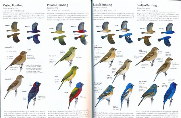
There are extras and little touches scattered throughout the book that delight the birder’s soul: the tiny drawing of what an untidy flock of cormorants looks like; the extensive, 2-page coverage of Mew Gull, Short-billed and Common; the small but specific silhouettes of hawks and falcons in flight, depicting their shapes while soaring, gliding and kiting; the beauty of the two pages showing Varied, Painted, Lazuli, and Indigo Bunting, with these passerines flying across the page, wings up on top, wings down on the bottom, colors of red, blue, yellow, green and white dancing in uniform lines. Yes, there are faults with this book, and no one knows this better than Sibley, who has allowed readers to list typos, transpositions, and switched labels on his website, Sibley Guides.
At this point, Victoria is probably still waiting for an answer to her question. Should she buy the new Sibley? It is a more difficult question to answer than I would have liked. This new edition of The Sibley Guide to Birds has been awaited for a long time. At $40 retail, it is still the most expensive North American identification guide around. The first edition of The Sibley Guide excelled in its content–quality of design, beauty and utility of art, accuracy and specificity of species descriptions, introductory and tutorial text. The second edition has improved on coverage (number of species), species descriptions, and on most of its design elements, but it also has some serious drawbacks, mainly the size and color of the font, the colors of several plates, and limited means of access to content. There are also a number of errors, typos and transpositions which should have been caught in the editing process. Overall, Sibley is still a guide that offers a very high level of content and that is remarkably easy to use for bird identification. David Sibley is not only a talented artist; he is an excellent craftsman of verbal descriptions of birds. Birders of all levels like to use Sibley’s, and there is a reason for that. It doesn’t talk down to beginners and it doesn’t simplify things for the more advanced. It is a pleasure to look at its pages as you use it, and the design works to help direct your eye to relevant images and text. So, this decision is really a balancing act. How much is the best bird identification content, updated, worth to you? For some, the quality of the font might trump content. For others, content is all, and you may find that you will quickly adjust to the font. The decision has to be yours, Victoria, and all my readers. I strongly suggest giving this new edition a try. I think you’ll find it will quickly look as used as those worn out copies of Sibley One sitting in the backseat of your car and on your desk and hidden in the hamper in your bathroom. Let’s face it; you can never have too many bird identification guides.
—————————————————
The Sibley Guide to Birds, Second Edition
Written and illustrated by David Allen Sibley
Knopf, 2014
9.5 x 6.4 x 1.5 inches, 624 pages.
ISBN: 030795790X, ISBN 13: 978-0307957900
$40.00 retail (discounts available from the usual sources)
iPhone app said to be available in a few months.
Alfred A Knopf provided review copies of this book to 10,000 Birds.


Well done, Donna; this is certainly among the very best reviews of any field guide I’ve ever read. Some great insights, well presented, and critical in the best sense.
When it comes to the making of the book, we shouldn’t forget that some of the apparent innovations in this new edition were anticipated in Sibley’s work on the smaller, regional volumes derived from the first edition. I’ve been very happy to see, for example, range, status, and behavior information from those books incorporated into the larger volume now.
The “front-heaviness” of certain shorebirds was first described, I think, or at least first described with that label, by Mary E. Tremaine in the 1970s. I’ll be interested to hear if others know of earlier uses.
The dotted lines are palimpsest, I believe, and I bet they disappear without a trace in future printings. I kind of miss them, myself, as they reminded me of an old Golden guide with all the Peterson arrows drawn in by hand.
As I’ve written elsewhere, the jarring colors of some of the birds really don’t bother me much: birders are pretty flexible in their brains, and we’ll get used to it. Meanwhile, Ridgway’s _Color Standards_ is on line (!), and it won’t be long, alas, anyway before this entire discussion becomes one about computer monitors rather than paper pages.
That tiny, bland print, on the other hand, is a problem for me, and I haven’t read the whole book through yet just because it’s so hard to see.
You couldn’t have chosen a better example than the terns to illustrate what is for me the bottom line: the best, most thoughtful and most instructive design in any field guide ever is now even better. That’s the Sibley triumph, and that’s what makes this guide truly great. Victoria should buy it and use it.
Thank you so much for your comments, Rick. This was a challenging review for me to write, and there was a lot left in the computer. Also, since I couldn’t write this review earlier, for personal reasons, I needed to bypass all of the many excellent reviews and comments that have already been published. (I like to approach my books fresh.) It was pretty hard, and I couldn’t escape every single comment. I am very happy I read that brief Facebook exchange on subspecies, it was very helpful. I don’t know if Victoria will purchase the second edition of Sibley’s, like all birders she has her own particular criteria, but I feel like I should buy one for her since her question helped me re-think my approach.
Thank you very much for this helpful review!
You’re welcome, Wendy. I appreciate the comment. There are many conversations about the new Sibley’s going on. It will be interesting to see what the regional editions will look like when they are published and how much the author and publisher respond to user feedback.
The book is obviously bordering on outstanding…but some of the assessments are misguided. I would give it an overall B …not an A+ or A. An A+ for content and a D for printing. The quality of printing is absolutely unacceptable, and I’m certain Mr. Sibley is furious about the slap to his name, albeit fixable and apparently not his fault. Sorry…but the colors are uniformly too dark (a mistake this edition, not an upgrade)… and the decision on font choice and density is simply a blunder. The fact that Mr. Sibley sent a representative to China to monitor the printing waives any innocent oops factor. As a design and printing expert, I traveled to Hong Kong and China on business for years to oversee production and quality control and wouldn’t have slept knowing that I let the final product slip 10-20%. While in China, I would have made the factory reprint them…which I have done. There is no acceptable reason to criticize or chastise birders who wish to wait for the 2nd printing of this remarkable book…or return the purchased item to Amazon or Barnes and Noble as I did. I don’t think it will take too long to burn through the 1st printing of 75,000 copies.
Tim Hill